Watercolor Trees, Skies, and People
Watercolor is probably the most widely used medium of plein air painters. It is easy to travel with, especially after September 11, and while one cannot get oil paints and solvents through airport security, watercolors are easy. Incorporating the local water into a painting is even better. My paintings contain water from the canals of Venice and Bruges, the bog in Flitwick Moor, and the River Neva in St. Petersburg, adding to the “spirit” of plein air painting. Knowing that some of the local DNA is in the painting gives me an extra pleasure when I look at it.
My objective in painting is to discover beauty, record it, and include the feelings and spirit of being there to see it. Degas once said, “A painting should strive to show not what is seen but what should be seen. Nature never gets it right” He meant that an artist should compose a work of art inspired by a scene but not enslaved to it. Over and over instructors preach “Paint the painting, not the picture.” As much as I believe these ideas, my paintings take a lot of heat from critics for being too representational, containing too many details, reporting a scene instead of producing an art work.
The “rules” of good composition are fairly simple. Some teachers have reduced the bulk of them to one universal rule- “Never make any two intervals the same.” Here, the term ‘interval’ applies to spacing, colors, contrasts, intensity, texture, details, and division of the painting into areas. Put the focus in the golden section (This breaks the painting into areas of two to one.) Put the horizon line high or low, never in the middle. Even if God provides you three equally spaced trees, change the spacing. Play brights against darks, high contrast against low contrast, cool colors against warm colors, large shapes against small shapes, and so on, with different intervals. Discover the patterns and repeat them.
Now comes the dilemma. You followed all the rules; you have a great painting-right? Wrong. Since you followed all the rules, your painting looks like everyone else’s and shows no originality. You should have broken some rules or at least come up with something unique that no one has made a rule for. Something original? With millions of artists, many who know the rules, painting everything in site, every day, coming up with something original is a pipe dream. Nevertheless, “I must create a system or be enslaved by another man’s”. –William Blake.
As I get more comfortable with painting, I have tended to incorporate more academics into paintings when it feels right. Sometimes it’s hard work, and I am painting mostly because it feels good to paint, and sometimes it just feels better to break some of the rules. Leaving out unimportant or distracting details takes extra effort (Everyone knows it takes more time and talent to compose a short letter than a long one or to make a short speech.). The same is often true about a painting. Nevertheless, I am intrigued by details, especially the details that I see only after I begin to draw the scene. These are like new discoveries. Sometimes the more details I put into a painting the more I love it, knowing all the time that the art critics hate it. I like buffets better than high cuisine; I can put a bit of everything on my tray. Gourmets hate buffets. Educated art snobs hate a lot of details.
In a three hour plein air setting I experience widely varying feelings, and sometimes all of these get into the painting. When animals and people walk into a painting I sometimes add them changing the whole focus of the painting. I am glad that I am not painting for critics. “A painting should have one focus with everything else either absent or out of focus. If a painting has more than one focus, it has no focus.” This rule seems especially true for watercolor where nothing important should happen outside of a small focused region in the painting. A typical watercolor sky usually incorporates wild colors beautifully flowing together in a fashion that you will never see in a real sky. Artists discovered that, while it looks nothing like a real sky, it is pleasing to look at, suggests a beautiful sky, and gives an impression of how fantastic and colorful skies can be and maybe how one feels about a beautiful sky. Especially transparent watercolors allow creation of beautiful color mixes.
I spend a lot of time fascinated by real clouds and skies. Some are so astounding and beautiful I cannot imagine improving upon them. Nature does get clouds right, and few artists have matched real skies I have seen. The usual defense given is “if you are going to report a scene exactly as it is, then why not just photograph it? Attempts at photographing real clouds are rarely successful; photographs I have made of really exciting skies turn our pretty ho hum. I think painting them stands a better chance at capturing their beauty, and perhaps a bit of exaggeration is necessary. Our eyes and brains process images in a way that cameras fail. Artists can preprocess such an image and paint some feeling into it and still paint a real sky. One of the problems is the large dynamic range in a real sky that cannot be captured in ordinary photography or even with paint. So while I have no objection to beautiful watercolor skies, I continue striving to paint some of the skies I have witnessed in a way that improves upon photography.
Nevertheless, like other artists who add a sky as a finish, almost as a second thought or a necessary evil, it is fun to run a lot of colors together making short order for a sky that has to be on the painting. It saves a lot of time when the painting is not really about the sky. A well known watercolorist, Don Andrews, quotes his favorite teacher (whose name I don’t know), “The best colors are ‘found’.” He runs a few colors together, watches them blend, and keeps messing with them until he finds something exciting.
The process is similar for trees. A tree, especially one with all of its foliage, is too complicated for the average viewer. Few people ever look at a tree long enough to see it, and they are used to seeing watercolor trees that always have more space between the clusters of leaves and fewer limbs. “Paint shapes, not details.” A splash of watercolor has become more interesting and easy to view than hundreds of leaves and it’s a lot easier to paint. An artist can take advantage of the process a viewer normally employs when looking at a real tree, a process that prevents him from seeing the details of the tree. The brain of the viewer automatically converts the splash of watercolor into a patch of leaves, leaves he rarely sees, shapes he usually perceives. Only the artist who sits before the tree for hours sees the leaves, and most of them only paint the shapes. An artist needs to learn what shapes are sufficient to provide a viewer all the information he needs to see a tree.
I have done leaves in a variety of ways, including “watercolor” leaves. I thought I had the simple cure all answer by using a sponge to dab on leaves. That didn’t win many kudos from some of the critics who count most to me, so I changed largely to the accepted approach. I finally began to handle leaving out most of the leaves, but I will still enjoy painting in a few leaves here and there next to the splash of watercolor.
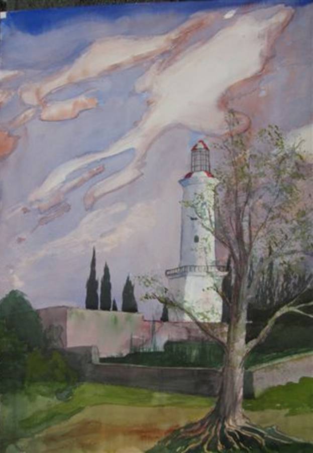
Colonia Del Sacramento Light House,
15”x 22, watercolor on paper, painted on location in Uruguay. Watercolor sky and
a sponged leaf tree.
Believe me, the root system really looked like that.
Another issue with trees and foliage is color. That brings me to the great Hooker’s green saga, which is a story in itself. To summarize, after searching for a green that appeared to me to be the closest thing to what I saw in flora, I discovered a color known as Hooker’s green, developed in the 19th century by a well known English artist/biologist named William Hooker to simplify painting plants. (Today, Windsor and Newton Hookers Green is a mixture of pigments number PG36 and PY110, i.e. pthalo green and isoindolinone yellow.) English painters latched onto Hooker’s green immediately, and it became their favorite green. But as is often the case in art, professional artists eventually resented it, snubbing their noses at the idea of a premixed green for foliage. “Hookers green is for amateurs.” The well known English artist, Charles Evans, recently commented that in the art world the users of Hooker’s green must behave like members of the Alcoholics Anonymous. They must introduce themselves by saying, “My name is John Doe. I am an artist, and I use Hooker’s green.” (Hooker’s green is Evans favorite green to start with in painting foliage.)
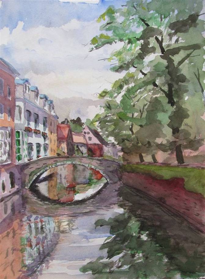
Watercolor Trees
Bruges, 11x15” watercolor on paper, painted on location in Bruges, Belgium
Faces
I love drawing faces; every face becomes beautiful to me after half an hour of drawing. Features that give someone a unique look are intriguing, though most schools teach that likeness should not be the goal except in portraiture, and that painting a likeness of a professional model is too personal. The typical watercolor face rendered by professional artists would scare hell out of me if I saw it on a real person. Nevertheless, that is considered artistic in a watercolor. Apparently viewers have become educated as to what a watercolor face should look like, so that is what they expect.
Most real faces intrigue me so much that I am driven to produce a likeness. I didn’t learn to draw so I could draw generic faces. Somewhat like clouds, these faces are better than anything I could ever make up. An especially beautiful face is miraculous to me. Such faces are extremely difficult to create without seeing the real person. It is often easy to make a face even more beautiful with a simple drawing change, and I consider that a good thing to do. Anyone can learn how to draw a pretty face in a few hours. To draw likenesses from life takes years of practice. I am yet to get excited about drawing an artistic non likeness.
Painting live tango dancers with master Tim Clark in a Buenos Aires salon is a good example of the difference between what the critics consider good art and representational art. Sitting with easels on the edge of a dance floor, the music bathed our souls as we drew, knowing each pose had to be limited to minutes. Tango dancers are trained to dance, not hold a fixed pose, so during each dancing interval we waited anxiously wondering how the next few minute pose would look from each of our perspectives. The dancers were exotic; their faces and bodies matched the precision of the dance perfectly. There was no way I would be happy with anything short of a likeness; to me it would have been blasphemy (Nature got it right here).
A few poses lasted 10 minutes, one as long as twenty. During each pose we had no way of knowing when our drawing of that pose was over. This made the process even more thrilling. During the 15 minute pose I produced a full body drawing of the two dancers that I loved more and more with each stroke as the likeness emerged and time ran out. The hastily taken, poorly lit photo is less of a reminder of my experience than the drawing I produced. A lot is missing in the photograph, the sounds, the smells, the movements, and knowing I was in a bar in Buenos Aires.
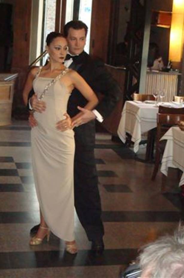
The Tango Dancers. They would dance for a while then freeze for us for 5 to 15 minutes. The range of poses was obviously limited.
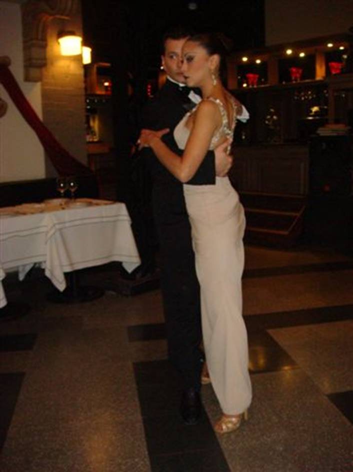
The final pose lasted 15 minutes.
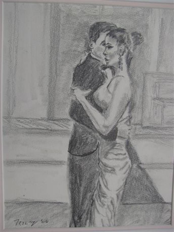
The Tango Dancers, 11x15 graphite on paper, drawn on location in Buenos Aires during a 15 minute pose. The only thing I did to the drawing later was to sign it.
Tim painted the same pose from a different vantage point. Being the professional he is, he produced a work of art. It is a wonderful watercolor. Nevertheless, I observe the world with a different set of eyes than most artists. To me, his lady looks like someone with Down’s syndrome on stilts, and the man looks like Count Dracula in a poorly fitted suit. If I met these characters in real life, I’d run like hell. Nevertheless, since it is a watercolor painting, it works and everyone knows that is how a watercolor person is supposed to look. These people are “stylized” the way watercolor faces are supposed to be. Even a novice appreciates a watercolor face. Will I ever paint like this? I don’t know.
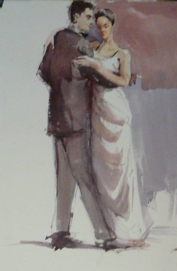
The Tango Dancers by
Timothy Clark, Watercolor on paper,
painted on location in Buenos Aires.
Another well known artist, Fred Hope, commented that if one paints a face with a smile, it looks too much like a photograph. People are not as used to seeing a watercolor smile, since artists paint from models who cannot hold a smile for hours. Therefore a watercolor smile must have been painted from a photograph. Someone said, “the simplest, fastest way to make yourself more attractive is to smile.” So sometimes, just for the hell of it, I turn the corner of the model’s mouth upward even when she wasn’t smiling. I bet that is what Leonardo did with The Jaconda (Mona Lisa).
To detail, or not to detail - that is the ………
Finally, after drawing thousands of good faces and thousands of bad ones, I learned something new from a book by Pinsker, “Drawing Figures with Impact.” Pinsker compares some drawings with details present and absent. For example a detailed drawing of a face is simplified in a second drawing that includes only a few important features, the eyes, parts of the lips, a few strokes for hair and a lot of empty space. This transforms a good but not very exciting picture to one that is clearly more artistic and in most respects more beautiful. I began to ask myself, “How can it be more beautiful.” Answering my own question, I realize that it is more beautiful because it invites me to finish the picture in my own mind, and that process makes it more beautiful than the artist could draw. Would it appear more beautiful to any observer? I don’t know. The simplicity of the lines makes it easier for me to process and start feeling the beauty sooner than if I had to deal with more information, more lines and details. Perhaps this principle applies to everything, not just faces.
When I draw a beautiful model, I see now that one misplaced line can trash the beauty. Many of those lines don’t have to be drawn, and drawing them only adds to the risk of getting them wrong. When the viewer interprets the drawing, he will put the line in the right place if he has been properly led to do so. So the trick is to put in just enough detail to enable the viewer to help finish the perfect painting in his mind. The process is not exactly trivial. It takes some real trial and effort to discover what lines are optimal for leaving out.
I am so happy I have time to paint, and not need to paint for a living. I already have a profession, and I don’t need another. The reason I paint is because painting makes me feel good. If painting ever becomes laborious to me, I will cease to paint. I will strive to learn from the masters as well as the critics, but there will be no compromise on painting the way that feels best. Conceivably, someday painting more “artistically” will feel best. For now, I have the luxury of not caring whether it does or doesn’t.
.