The Great Hooker's Green Saga
England
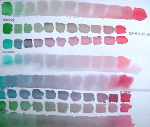
Mixing (near) complements to produce grays and vary chroma and value
Start with something like alizarin crimson or quinacridone red and sequentially add in a green like Phthalo green until after six or seven steps you have pure phthalo green. In the middle you get a beautiful gray or black (depending on how much paint you add). In the fence row I can see almost every colour in the set, plus a few extra that you can get if you throw in a bit of cadmium yellow. (The right hand side of her garden has the rest of the rainbow in it, but that is another story.)
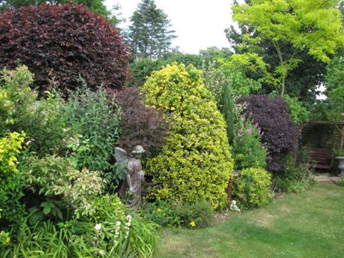
The green/red palette in Pauline’s English garden
One problem is I don’t see anything in there that is phthalo green, one of the more common green pigments, PG36. When I first started doing plein air painting and knew almost nothing about mixing colours, I searched for a green that, out of the tube, resembled some sort of foliage I had seen, so I would at least start from somewhere I could identify. None of the standard greens even closely resemble tree leaves or grass I have ever seen. Then I discovered Hooker’s green. It looked much like some of the brightest foliage I had seen, especially in England.
I immediately drew a lot of criticism from fellow artists since apparently no foliage except that of the English countryside resembles Hooker’s green. Some artists even claim you should never start with green to try to produce a usable green. Typically, one must add blue red and yellow to get a usable green or at least add red and green. In fact, what I saw when I looked at many trees was not far from Hooker’s green. At first I often responded to critics by saying “And God created trees and he said, ‘Let there be Hooker’s green’.” Nevertheless, when I finally learned how to mix green from yellow, blue and red, or from Phthalo green and yellow, I used Hooker’s green less and less. My trees and grass at least started looking like other artist’s trees and grass, though, in my opinion, still often not like real trees and grass.
Now I come to t he funny part of the story.
On my first evening in England, this summer I attended a Charles Evans watercolour demonstration sponsored by the local art association. Charles Evans is a well known English artist and teacher who has produced many how-to art books and DVD’s. His website, http://www.charlesevansart.com/index.htm , offers some very useful exercises/projects in watercolour.
During his lecture he kept the audience entertained for two hours with painting tricks, combined with stories, and jokes, used as time fillers while the paint in his demonstration is drying to the right state. Knowing exactly when that is represents a skill he fails to mention, maybe because it takes much practise. In the two hours he completed six different paintings, including a few “parlour trick” demos such as producing a beautiful mountain scene in 3 minutes with a large brush, three colours, and a credit card. At one stage of a painting he strummed his partially wet painting like a stringed instrument producing believable grass in the foreground. “That is one tool that is not commercially available,” he quipped, and added, “Are there any questions?” which drew a good laugh from the audience.
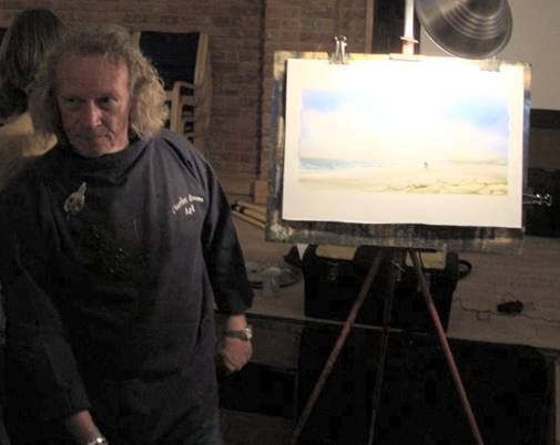
Charles Evans lecturing to the Bedfordshire Art Association
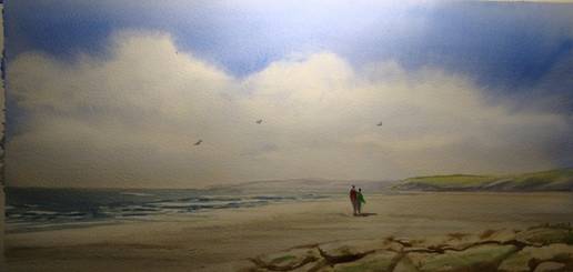
Charles Evan’s painting done during the demonstration
But the thing that gave me the greatest satisfaction was a story he told concerning his choice of colours for his palette. When Charles Evans described his palette, he said that most of his paintings are done with 8 colours, and he then told a story about his choice of green.
A famous English botanist/artist in the 19th century (Headed up the well known Kew Gardens in London), painted plants extensively and especially while travelling, he found mixing greens to be unusually cumbersome and unpredictable. He decided he could save a lot of time and steps if he could find a hue he could start from and more easily match plant hues with predictable mixing. After an extensive search he discovered a blend of blue and yellow that gave him an excellent starting point for easy realistic mixing most of the hues and values needed for many plants and trees.
A few companies picked up on it and began producing different versions of it and eventually the major companies, like Windsor and Newton, produced their own blend that was more permanent and predictable. (Today, Windsor and Newton Hookers Green is a mixture of pigments number PG36 and PY110, i.e. pthalo green and isoindolinone yellow.) It is typically a dark valued, dull yellow green hue; it makes more natural foliage than most other greens and became a preferred green paint among 19th century landscape and botanical painters. The botanist’s name? William Hooker. The hue took on the name, Hooker’s green. (The story can be read also on the Handprint website: http://www.handprint.com/HP/WCL/waterg .)
Evans then said, But as is often the case in art, professional artists eventually resented it, thumbing their noses at the idea of a premixed green for foliage. “Hookers green is for amateurs. If you want to use Hooker’s green you have to be like an alcoholic at an Alcohol Anonymous meeting. You introduce yourself to a group of artists by saying, ‘My name is Charles Evans’ I am an artist and I use Hooker’s green.” Hooker’s green is essentially the only green hue he uses. He almost always mixes it with something, but for him it is a great starting point for many colors he wants to achieve.
Since that evening I have rounded up all my old tubes of Hooker’s green and rediscovered how much easier it is to use in painting realistic foliage. The lesson I relearned once again is that when it comes to art, it is good to listen to as much advise as you can, but don’t take any of it too seriously.